Friday, October 27, 2006

The Koop tie question

I haven't heard any customer comments about similarities to the Confederate flag before yours, Family Doc. Here is an explanation of the design elements so you can discuss them with curious friends.

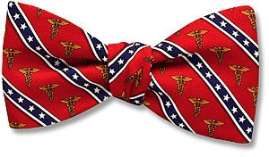
Dr. Koop helped design his tie with certain symbolism in mind. The blue stripe with white stars represents his government and military service, and is reproduced from the same pattern shown on his commemorative coin, presented to him by the Navy. (Dr. Koop's stripes do not cross at any point, as they do in the Confederate battle flag.) Red was chosen for the background since Dr. Koop only likes red ties, especially with dress whites. The gold caduceus symbols represent the medical profession. Together, these three elements are intended to be simultaneously patriotic and medical.


Dr. Koop is very pleased with his tie, and I hope you are, as well!

Thursday, October 26, 2006

One of life's great mysteries

I looked down at my keyboard just now and noticed that the painted letter "N" has nearly completely worn away. All the other keys have their letters intact.

What is it about "N" that makes it wear out first? Do I use it more often? There are two "N"s in Kenerson, which I type quite frequently, so perhaps that's the problem. But there are two "L"s in "Bill", so why isn't the "L" worn out, as well?

Don't even get me started on "E".